Create and Edit Charts and Reports
This article details the options available in the Charts/Reports wizard, as well as some example predefined reports and an explanation of reporting permissions. Reports and charts are created using the same wizard so you can develop them in parallel, or quickly create charts from existing reports and vice versa. The Report Type determines the format used to present the information, and some report types have separate articles covering their unique configuration in more detail.
Before configuring your own charts and reports for the first time, explore the predefined reports automatically configured in Agiloft and learn more about how permissions work with reporting.
You can customize the colors of your charts and reports in the Charts and Reports tab of the Look and Feel editor. Charts and reports also leverage the color scheme configured on the Global tab.
Predefined Reports
Agiloft comes with dozens of built-in charts and reports that you can use to visually represent business data, and to familiarize yourself with Agiloft reporting capabilities.
You can see any configured charts and reports by expanding the table name in the navigation menu and clicking the Charts/Reports link. The link opens a complete list of all the charts and reports configured for the table that are available for you to use.
Some examples of the available predefined reports include:
- Expected sales revenues by region
- Deal closure rates by industry
- Open case numbers per support
- Person or leads conversion rates against sales method
You can even select an existing report and click Copy to duplicate it, and then make adjustments to it to create a similar report. This can save time and troubleshooting when you want to report on similar data.
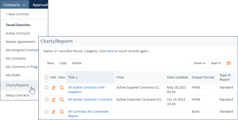
As you create new reports, they are added to the list for the table.
Permissions and Security
There are three tiers of access for charts and reports. Access is controlled by the user's group membership, and you can configure reporting access separately for each table.
| Access Level | Settings | What the User Sees |
|---|---|---|
| No access | Allow creating/editing/deleting Reports?: Don't allow Allow using Reports?: Don't allow Allow group to publish saved reports: No | The Charts/Reports link does not appear under the table at all. Charts and reports can still be shared with these users if the reports are sent by email or written to the hard drive and shared outside Agiloft. |
| View access | Allow creating/editing/deleting Reports?: Don't allow Allow using Reports?: Allow using published Reports only, or Allow using all Reports Allow group to publish saved reports: No | The Charts/Reports link appears under the table. If you choose Allow using published Reports only, the list includes only charts and reports for which the Published checkbox has been selected. If you choose Allow using all Reports, the list includes all charts and reports. |
| Edit access | Allow creating/editing/deleting Reports?: Allow group to modify/delete/run saved reports that they created, or Allow group to modify/delete all saved reports Allow using Reports?: Allow using published Reports only, or Allow using all Reports Allow group to publish saved reports: Yes or No | The Charts/Reports link appears under the table, and users can create and edit reports. If you choose Allow group to modify/delete/run saved reports that they created, users can only edit their own saved reports. Keep in mind that the Allow using Reports? field determines what is visible to the user, even if the user is allowed to edit all saved reports. If you choose to allow the group to publish saved reports, users can share their reports with users who can see only published reports. All users who create reports can use the scheduling options to share their reports with other users, even if those users don't have access to charts and reports or even Agiloft itself. |
Group permissions also determine users' access to the data included in the chart or report, which means that the same report automatically shows a unique set of data for each user group, depending on their permissions. If a user doesn't have permission to view a field that is included in a report, the field is not shown when they view the report. When saved searches restrict a user from seeing a certain record or field, the record is not included in the report, or the field is shown as a field header with no values.
Permissions apply even when you send a chart or report in an email, as long as you select users and teams as the recipients rather than manually entering email addresses. When email addresses are manually entered, there are no associated permissions, so the Guest group permissions are used.
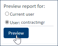
When creating a chart or report, you can use the Preview tab of the wizard to see how it will appear to a specific user.
Chart/Report Wizard
Reports and charts are created using the same wizard so you can develop them in parallel, or quickly create charts from existing reports and vice versa. The wizard contains different tabs depending on the report format. Initially, only the General and Type tabs are visible, but after selecting the report output, the relevant wizard tabs appear.
![]()
General
The General tab is where you name your chart or report, select which table or subtable it applies to, give it a description, and select the output format. For graphical charts, you can select the Use JavaScript Charts option to allow users to select and hide data from the X Axis, and to automatically resize the chart based on screen dimensions.
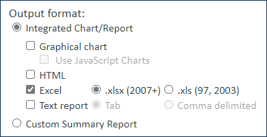
The output format you select determines the rest of the tabs in the wizard; once the Type has been selected, the other relevant tabs appear.
Output Format | Additional Tabs |
|---|---|
| Graphical chart | Type, X Axis, Y Axis, Filter, Drill Down (if JavaScript Charts are enabled), Formatting, Schedule |
| HTML | Filter, Grouping/Summary, Report Template, Schedule |
| Excel | Filter, Grouping/Summary, Customize Excel, Schedule |
| Text Report | Filter, Grouping/Summary , Schedule |
| Custom Summary Report | Custom Summary, Schedule |
For more information, see Report Output Types.
Type
The Type tab defines the type of chart or report being created. There are three basic types of report: standard, elapsed time analysis/SLA, and trend analysis. If you aren't reporting on an Elapsed Time field or on historical trends over time, use the Standard type.
Standard
Shows values from fields in records, with the potential to calculate averages or totals of field values and to sort and group down to an unlimited number of levels.
Elapsed Time Analysis/SLA
To create a chart or report which shows the average length of time a record spends in each status, or how long records are assigned to a team or person, use Elapsed Time Analysis/SLA. For an Elapsed Time Analysis/SLA report, select the elapsed time field and the record field to run the report against. The Elapsed Time Analysis/SLA option only appears if the current table contains a field with an Elapsed Time data type, such as the Approvals or Tasks tables.
Example
For example, to show the average time a service request spends assigned to a given person, use the Total Hours to Close field and segment changes based on Assigned Person.
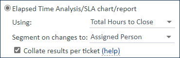
To create a chart based on elapsed time, we recommend using a Column Bar chart. In this example, on the Axis tabs of the Charts wizard, you would choose an X Axis of Assigned Person and a Y Axis of Average of the Total Hours to Close field.
By default, the system treats each record as a single event, meaning that it adds up the time an individual user or team spends on a single record before calculating averages. For example, if a user spends two hours on a request, passes it to another user, and then gets the request back and spends another three hours on it, the system adds up this time and determines that the user spent five hours on this request. If you need to treat those work periods as separate entities, where the user spent two hours on a request and then three hours on a request, clear the "Collate results per ticket" box.
Example
Akancha spends two hours on a service request. The record is then reassigned to someone else for a few hours. The record is reassigned to Akancha again, and they spend another three hours on the record.
- Selecting "Collate results per ticket" tells the system to add up all of Akancha's time spent on the request. This results in an average of five hours per ticket in this scenario.
- Not collating results tells the system to treat each time period as a separate instance. The results in this case show that Akancha spent an average of 2.5 hours per request.
Elapsed time calculations consider only time spent while the record was active, defined in the Elapsed Time field used for the report. In our example, the Total Hours to Close field measures the elapsed time between Date Created and Date Closed, with no time excluded from the calculation. That means evening and weekend hours are counted. You might need to reconsider your field configuration or create a new field that recalculates the data if you have different needs for reporting.
Trend Analysis
Shows historical trends over time, such as the number of open service requests that existed at the start of each month. Trend charts use the history engine to display data based on slices of time at specified intervals. You see the same data when you click the History tab in a record.
For a Trend Analysis type of report, select the time interval to measure from the drop-down menu. If you select Automatically find optimal time increment, the system chooses a time segment that produces between four and twelve slices. For example, if there are five weeks of data, it chooses one-week increments; if there is only one week, it chooses one-day increments.
Example
For example, to show the number of open service requests at the start of each month, use Months as the time segment.
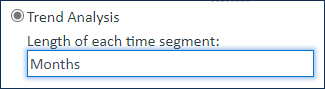
Chart Type
For graphical charts, the Chart Type tab determines the visual output, such as a pie chart or a segmented line chart. For more information, see Graphical Charts.
Chart types include:
- Multiple Axes Chart
- Column Bar Chart
- Segmented Column Bar Chart
- Line Chart
- Segmented Line Chart
- Pie Chart
- Multiple Pies Chart
- Ring Chart
- Funnel Chart
- Multiple Gauges Chart
- Gauge Chart
X and Y Axis
For graphical charts, these tabs control what is shown on the X (horizontal) and Y (vertical) axes of the report. The X axis determines the first level of grouping if there is an associated report, and the Y axis determines the second level.
The X Axis options include the field to report on and the sorting and ordering options for data grouping.
The Y Axis options include the options to segment the X axis by, whether to use a custom label, and whether to display the segments by number or as a percentage of the total in that segment.
There are four ways to segment the vertical axis:
- By the number of records in the table
- As a function of a selected field - for example, the Maximum of Field A records
- As a computation between two fields - for example, the Average obtained by adding Field A to Field B
- As a formula
Example
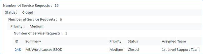
For example, consider a chart of service requests by priority. Use the Status field on the X Axis and the number of requests on the Y Axis, with Y Axis bars segmented by the Priority field. These settings create a segmented bar chart.
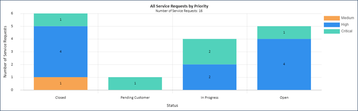
The Report tab shows the same data as a written report. Notice the X Axis field, Status, is the top-level grouping. Next, the results are grouped by Priority, as defined on the Y Axis. The number of requests is the final layer of grouping on the written report.
Filter
You can filter the records included in reports by a date range for record creation or modification, and by more complex custom criteria using a saved search.
Date ranges can be either of two options:
- A relative time range - for example, the date of the earliest record from a month ago, until today
- An absolute date range - for example, 20 January 2015 - 15 March 2017
After you select the range, you must select the field to base the date range on. For absolute date periods, you can choose to use the History field instead. Finally, choose which records to display from the date range selected.
You can also apply a saved search filter to the report, and select whether the report should display current data, or historic data that was in place at the time when the filter criteria were met. If necessary, you can also choose to convert HTML and XML-formatted text into plain text. This removes HTML and XML tags and exports only the content.
You can use saved searches with run-time filters to minimize the number of charts and reports you need to create and maintain. For instance, suppose you do consulting projects for a number of companies and want to send reports specific to each customer covering different ranges of time. In this case, you can use a single report which is filtered by a run-time saved search with a run-time filter for the start and end dates and a run-time filter for the company name.
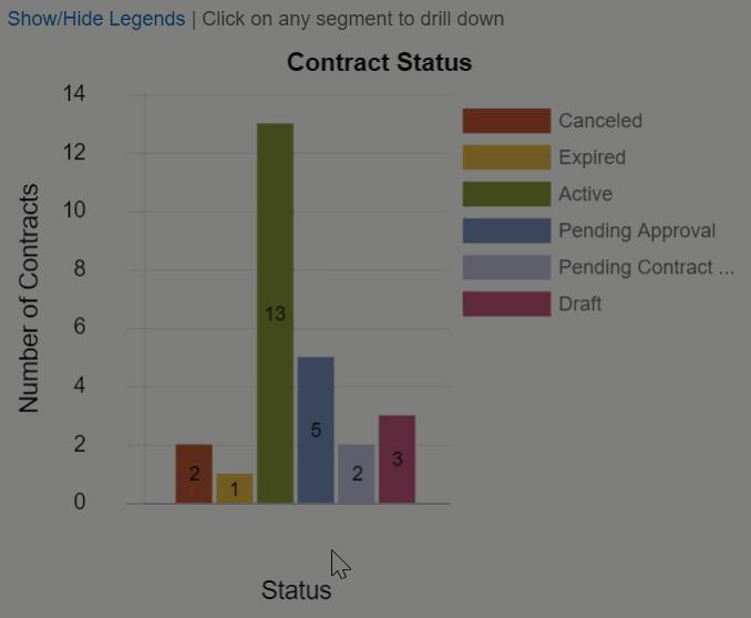
Drill Down
You can add drill-down features to JavaScript charts so that if the user clicks on a segment of the chart, a new chart opens with details about that segment. You can add multiple drill-down layers to break the data down further. Click Add to create a drill-down and then define the title of the resulting drill-down chart; the field you want to use on the X Axis of the drill-down chart; and the sorting and order of the groups.
For example, when reviewing the number of contracts in each status, it might be useful to see the assigned team so you can identify potential bottlenecks. Then, after you drill down to the teams assigned to contracts in that status, you might want to see how many of those contracts were created recently and how many have lingered with that team. Here, we have a bar chart of contracts by status with two drill-downs defined: Assigned Team and Date Created. Notice the X Axis changes for each drill down, but the Y Axis always shows the number of contracts.
Formatting
For graphical charts, use this tab to configure the chart's appearance, including:
- Three dimensional effects
- Whether to display numeric values
- Legends
- Titles
- Generation dates
- Chart size
Grouping/Summary
The Grouping/Summary tab controls how the information in the report is grouped, which view will be used to display it, and the summary information to include.
Summary
Reports can include an overall summary, which appears at the beginning of the report. If you include groupings in the report, each grouping can also have a summary displayed on a separate line above the grouping.
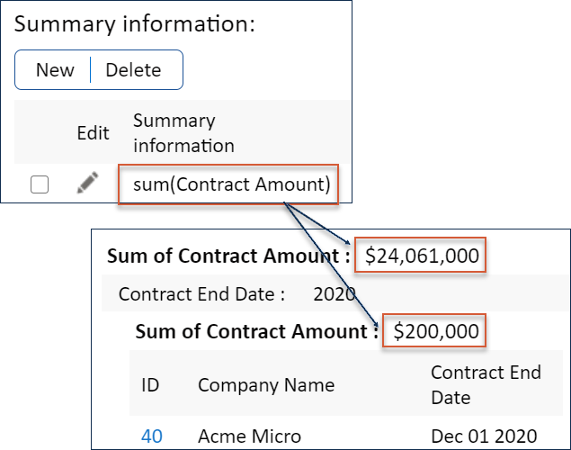
To configure a summary for your report, click New or edit a summary to open the Summary screen, where you can create a summary function. Summary options are similar to those in the Y Axis .
Grouping
You can sort report data into groups to make large reports more readable, identify patterns and trends, and more. For example, you might want to group the records based on their Priority and calculate the average cost for each Priority set in the grouping summary. This data can also be included with the summary information for the whole report.
To configure a grouping:
- Click New or edit a grouping to open the Grouping Chart Data wizard. Here you can create custom groupings, similarly to those for the X Axis.
- In the Grouping tab, define a field to group the data by and optionally create a summary to display on top of the grouping, and select whether to add a page break before each new group.
- In the Sorting tab, define the order to sort the grouped data by, and whether to show the results in ascending or descending order.
Customize Excel
Excel reports can be customized by creating an Excel template in your knowledgebase. Customization can include elements like pivot tables and custom charts. For more information, see Excel Reports.
You can use formulas to show knowledgebase data in your Excel report. Click Formula Help on the Customize Excel tab to see an overview of all the formulas you can use.
Report Template (or Custom Summary)
The Report Template tab contains an HTML editor, where you can customize HTML reports. Use the WYSIWYG editor or edit the source HTML to control the appearance, colors, and formatting of HTML reports.
When creating a custom summary report, this tab is titled Custom Summary. See Custom Summary Reports for more guidance on using this tab.
Schedule
On the Schedule tab, you can set a schedule for when the system automatically runs and distributes the report. Reports and charts can be run at a specified frequency and time and distributed by email or written to a file folder on the server, if you have access to it. You can use these distribution methods to:
- Send charts and reports to users or external parties who don't have access to view charts and reports in your system
- Share charts and reports outside of Agiloft by writing a chart to a location on the server and then hosting it on your own website
- Run charts and reports a single time for multiple users, minimizing the resources required to generate and share the data
- Keep teams on the same page by sending all team members the same charts and reports generated at the same time, and making sure the charts and reports are sent at regular intervals
Schedule reports carefully to avoid overloading the system during peak hours. Complex charts can be resource intensive, particularly when thousands of records are found and must be collated. Due to the high potential server workload of reports, access to them should be restricted to experienced users, such as managers and administrators. They should be scheduled to run daily or weekly, during off hours when possible. Use the Report Frequency global variable to control the minimum number of minutes that can be used in the "Every __ hours and __ minutes" option.
Permissions apply even when you send a chart or report in an email, as long as you select users and teams as the recipients rather than manually entering email addresses, or if the manually entered address matches an existing user. When email addresses that do not match an existing person record are manually entered, there are no associated permissions, so the Guest group permissions are used.
If you want to use Guest group permissions for an email address that does match a person record, you can use sub-addressing to do so. For instance, if you want to use Guest permissions to send a report to helen.jensen@example.com, but the address is tied to a user with additional permissions, you can send the report to helen.jensen+donotmatchonemployee@example.com. Since the addresses no longer match, Guest permissions are used. Note however that MS Exchange (and therefore MS Outlook) will not accept sub-addressed inbound mail.
Preview
Use the Preview tab to test your configuration and make sure it looks and works the way you want it to. You can test it with the current user or specify another user to make sure the report shows appropriate data for users with different permissions. The Preview tab is a powerful tool when working with reports, especially when creating a new one from scratch. Make sure to test your report thoroughly before you distribute it to other users.